Art
Portrait Party
17/01/19 15:20
Thinking about the portrait party to be hosted at the HSAD by the Urban Sketchers and addressing the "make it bold" admonition Mark Liebowitz passed along. So how to approach a portrait quickly is the question? I enjoy the portrait party as it gets me out of my routine and forces me to be succinct, direct and expressive. While working with a brush pen would yield more controlled results, I've used acrylic paint to tackle each of the portrait parties I've attended for a number of reasons, speed being the foremost consideration. Not every medium favors speed, so picking one that can be worked fast is important. Pastels, stick charcoal, brush pens all can make quick work of a scene. Bigger mediums help with bigger drawings, so think accordingly. a stick charcoal will do more than a pencil. A 1-inch flat or bright brush will cover more than a #000 round.
 Conversley project what this is not, namely a study, a carefully made visual rumination on the subject's features. To the Left is a portrait study of Chris done in 20 minutes, double the time available for the portrait party. This is not what a 10-minute sketch can get at the scale needed to make the grid at the end of the party look cohesive.
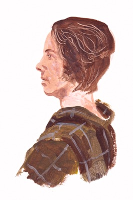
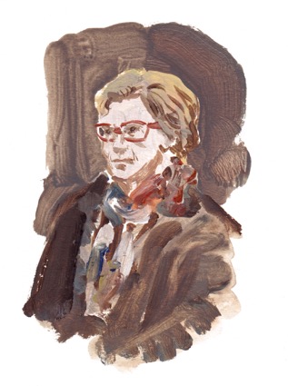
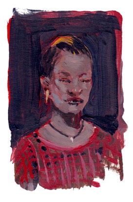
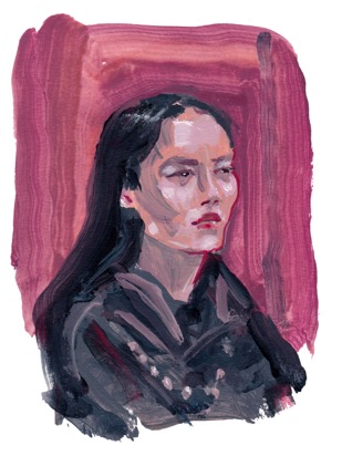
Another strategy is to bump the impact of the image is to work actual or dark negative space around the the subject. In the three examples below, the background was rapidly brushed in. In each case, the portraits were done similarly to those above, but the contours off the face where realized by the careful painting in of the darker color behind. It may be evident that in particular parts of each image—at the edges—control is let go of and a nod is given to the natural florish a brush and produce. It is a personal choice, but adds a nice juxtaposition to the control found within the interior marks found on each likeness.
Thanks for visiting and reading through. Putting words to quick sketches is—unfortunately—not as quick as making the portraits themselves. I'm scheduled to take part in the portrait party and I'm planning to employ the same media and methodology described here. See you there!
Conversley project what this is not, namely a study, a carefully made visual rumination on the subject's features. To the Left is a portrait study of Chris done in 20 minutes, double the time available for the portrait party. This is not what a 10-minute sketch can get at the scale needed to make the grid at the end of the party look cohesive.
Strategies For Speed: The Man in the Cap
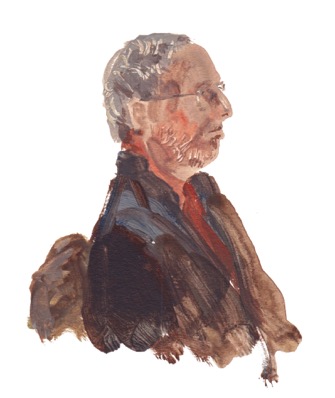
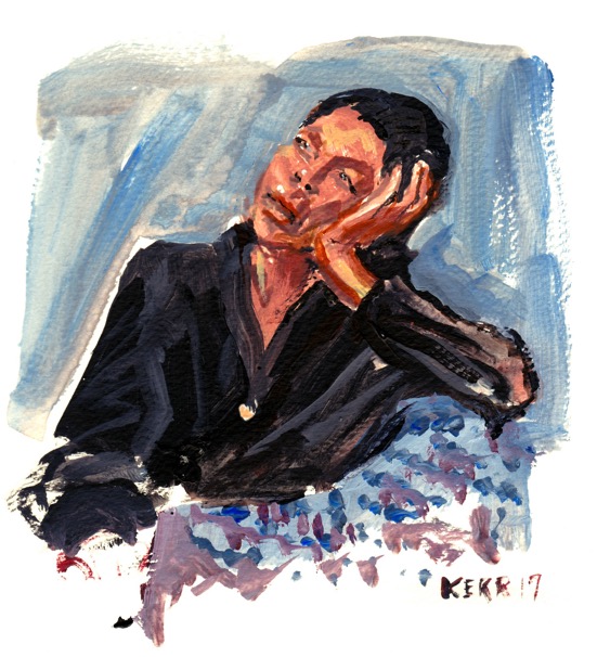
Due to a spotty memory, I don't remember his name, but I'll focus on this image of the man in a cap as it holds within it a pretty clear roadmap to the technique I've employed in these portraits. First thing I decided is that this would be a vignette using negative white space. This tends to pop the subject graphically and turns the focus to the likeness. First thing I did was think of the order of values I'd be laying down. I was not thinking of blending, delicate subtile transitions, but rather what was the dominant tones and more specifically, which was the lightest. This is due to the fact that my washes of paint will vary from semi transparent—like watercolor—to fully opaque. I drew the face in that one value directly with the brush. I didn't do underdrawing as it would slow me down. Next was that same flesh tone mixed to a distinctly darker value which I used to his the shadow under his cap, the shape found at the base of his nose, cheekbones, mouth, lower lip, chin and neck. I then took a umber mixed with payne's grey and painted the cap and what was visible of the shirt at the base of his neck. I then loaded the brush with a bright cad-red and knocked the vest in. I even hit a bit of the details in his hear with it. You can see that the marks on the man in the cap's face are discrete. three at the ear, maybe a dozen for the face, 7 or 8 for the cap and a handful for the vest and shirt. I feel this was successful. The thing that helps aid all of this is accuracy, not just recognizing the marks, but putting them where they ought to be. This takes familiarity with the face and the medium, along with the tools they're applied with. 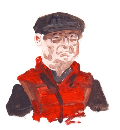 Below, you can see that the same strategy of painting from light to dark using a similar scheme was done with the portraits of Katie and Mark.
Below, you can see that the same strategy of painting from light to dark using a similar scheme was done with the portraits of Katie and Mark. Another strategy is to bump the impact of the image is to work actual or dark negative space around the the subject. In the three examples below, the background was rapidly brushed in. In each case, the portraits were done similarly to those above, but the contours off the face where realized by the careful painting in of the darker color behind. It may be evident that in particular parts of each image—at the edges—control is let go of and a nod is given to the natural florish a brush and produce. It is a personal choice, but adds a nice juxtaposition to the control found within the interior marks found on each likeness.
Thanks for visiting and reading through. Putting words to quick sketches is—unfortunately—not as quick as making the portraits themselves. I'm scheduled to take part in the portrait party and I'm planning to employ the same media and methodology described here. See you there!
Comments
Zombie snowpopcolypse bomb cyclone
05/01/18 17:21
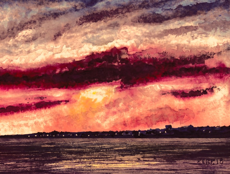
Didn't document the zombie snowpopcolypse bomb cyclone, but I did make my first watercolor of 2018, featuring the setting sun over Sandy Hook as seen from Rockaway Park, NY. One of those occasions where my poor scanner didn't--IMHO--adequately reproduce the color of my scan; regardless of the care I put into adjusting the balance. The original is so much more satisfying. Just the same, hope you enjoy it as you sketch-on into the New Year.